


Statistical Process Control Charts
Control Charts are a key tool used in the Six Sigma methodology. They help you measure and track process performance, identify potential problems, and determine corrective actions.
Control charts in Six Sigma are significant for monitoring and controlling process variation, ensuring process stability, and improving quality. By understanding how control charts work, you can more effectively use them to improve your process and product quality. Here’s a brief overview of control charts and how they can be used in Six Sigma.
How Do Control Charts Work?
Control charts help you understand whether a process is stable or not. They do this by tracking the output of a process over time and graphing it so that you can see patterns. If the output of a process changes too much, it indicates that the process is not stable and needs improvement. Control charts help identify when a process is ‘out of control’ by showing when there are special causes of variation, which need to be addressed to improve process quality.
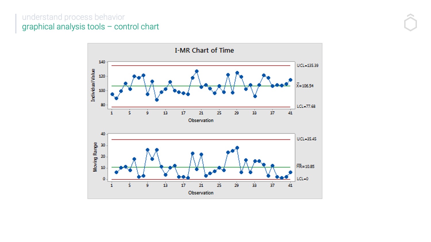
A control chart is often called a Shewhart chart since its introduction by William A Shewhart in 1926. The process behaviour is sometimes called a behaviour chart. It shows how this process behaves over time. However, in Six Sigma study control charts are typically read in control phases..
What is a control chart and its types?
There are two types of control charts: Attribute Control Charts and Variable Control Charts.
Attribute control charts are used when your data is categorical (e.g. “defective” or “not defective”) – you can learn more about attribute data here.
Variable control charts are used when your data is numerical (e.g. weight or length).
A Six Sigma Control Chart plays a crucial role in monitoring and analyzing process stability and performance over time.
Types of control charts
Control charts consist of seven kinds based on their respective data types. If the data are continuous, they can be compared with the X-BarS-Chart to the IMR Chart. We use four control chart types: P, NP, C and U charts. The control chart is significant in Six Sigma for detecting special cause variation and estimating process average and variation.


Continuous Data
If the data is individual data points or in rational subgroups, we can choose between 3 different control charts.
I-MR Charts – for Analysing individual data points
X Bar-R Chart – For analysing the averages of small subgroups
X Bar-S Chart – For analysing the average of large subgroups
Six Sigma control charts are significant in monitoring and controlling process variation within the Six Sigma methodology. They visually represent process performance over time, identify patterns, detect deviations, and enable data-driven decisions for continuous improvement.
Count Data
U Chart – for analysing the count or defects per unit
C Chart – for analysing the count of defect rate when subgroup size is constant)
Attribute Data
P Chart – for analysing the proportions or percentages
NP Chart – for analysing the proportions when the subgroup size is constant

What are the 3 elements of a control chart?
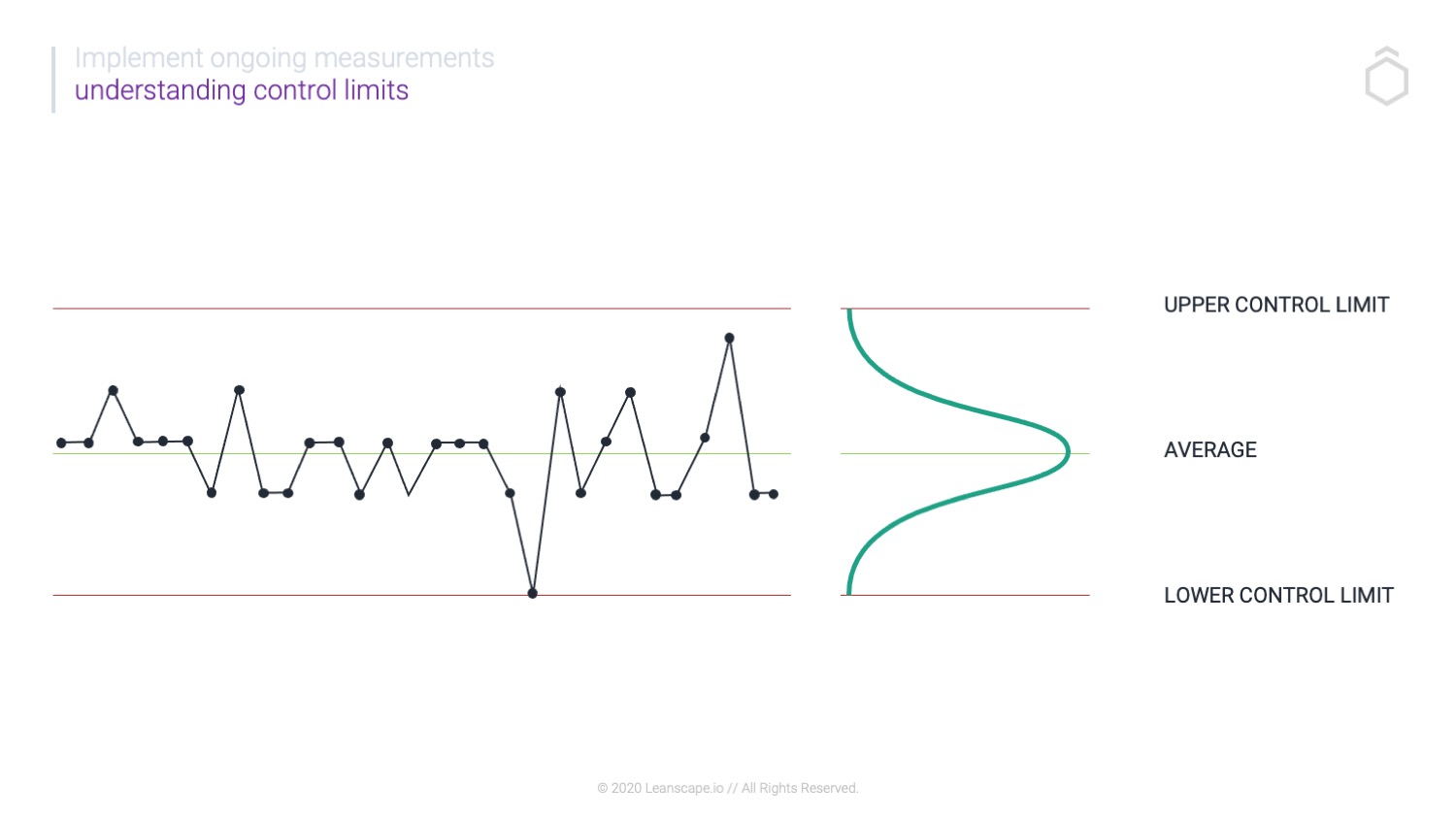
Control charts have three essential elements:
A centerline that represents the mean or average value of the process output
Upper Control Limit and lower control limits (UCL and LCL) that show the acceptable range of variation for the process
Data points that represent the actual output of the process over time
A Six Sigma Control Chart includes these elements and helps in interpreting process stability and performance by detecting special cause variations and calculating control limits.
How do you interpret a control chart?
Control charts help identify when a process is ‘out of control’ by highlighting special causes of variation that need to be addressed. It is crucial to take corrective actions to improve process quality when these variations are detected.
Common patterns include trends, spikes, outliers and shifts. These patterns can indicate problems with the process that needs to be addressed.
We expect every process to move around the central line (mean) with some data points above and an equal number of data points below. This is called process shift and common cause variation. We also expect that if the data is in control, all data points should fall within the chart’s upper control limit and lower control limit.
As the process variation should fluctuate around the average, the control charts help us identify trends and unlikely data points, highlighting areas for monitoring and further investigation.
How do you calculate Control Limits?
There are a few different methods for calculating control limits, but the most common is called the 3-sigma method. This method uses the standard deviation of the data to calculate the control limits. Control limits are typically set at +/- 3 standard deviations from the mean.
To find the Upper Control Limit.
To calculate the upper control limits, find the mean of your data set and the standard deviation (sigma). Take your mean and add three standard deviations to find the upper control limit.
To find the Lower Control Limit
To calculate the lower control limits, find the mean of your data set and the standard deviation (sigma). Take your mean and subtract three standard deviations to find the lower control limit.
Significance & Objective of a Control Chart in Six Sigma
Control charts are a fundamental tool in the Six Sigma methodology, used to monitor and control process performance. They help in identifying patterns, detecting deviations, and making data-driven decisions for continuous improvement. By visually representing process performance over time, control charts provide valuable insights into the stability and capability of processes.
Six Sigma control charts are particularly significant in monitoring and controlling process variation within the Six Sigma methodology.
Statistical Process Control
Statistical process control (SPC) uses this approach to monitor and control a process. If all data falls within the Upper and Lower Control Limits, the process is said to be in statistical process control.
Special Cause Variation
We use a control diagram to show different effect variations. The “special cause variation” isn’t necessarily an indicator of negative aspects of the process, but it is usually indicative of the process itself. We have special cases and processes variation that can be prevented by adopting preventative measures. In other words, we can prevent a car from falling because of faulty tires. Special causes are sometimes called assignable causes since they are preventable, while common causes are inescapable.
Why Use Control Charts?
Control charts (Shewhart Control Chart) are primarily used to improve processes by reducing variation. Variation can cause problems such as missed deadlines, poor-quality products and unhappy customers. By using control charts to find and eliminate sources of variation, you can improve the quality of your products or services and make your customers happier. In addition, reducing variation can also help you save money by reducing waste and scrap. A Six Sigma Control Chart plays a crucial role in monitoring and analyzing process stability and performance over time, further aiding in business improvement by reducing variation.
Conclusion:
To improve the quality of your product or process, you need to use control charts. Control charts help you understand how your process is performing over time so that you can identify areas where quality is slipping. This allows you to take steps to correct it, which leads to fewer defects, less waste, and happier customers.
To learn more about Statistical Process Control Charts, join our Lean Six Sigma Green Belt Course. Learn how to measure and transform your processes.


