
An Introduction to the Box Plot
In this post, we provide a comprehensive overview of the box plot. The box plot is a graphical representation of data used to summarize data distribution. I explain how to interpret the different elements of the box plot and demonstrate how to create one.
A box plot—also called a Box & Whisker Plot—is a graphical representation of data showing the distribution of the values in a dataset. It can be used to identify outliers and check for symmetry. Box plots are commonly used in statistical analysis, data science, and machine learning. In this blog post, we’ll take a comprehensive look at box plots: what they are, how to create them, and how to interpret them. By the end of this post, you’ll be an expert on box plots!
What is a Box Plot?
A box plot is a graphical way of representing data. It shows the distribution of values in a dataset. The “box” part of the name comes from the fact that the main body of the plot is shaped like a box. The “whiskers” part of the name comes from the two lines that extend from either side of the box; these represent the minimum and maximum values in the dataset. The body of the box contains 50% of the data points (i.e., the middle 50%), and the whiskers contain 25% of the data points (i.e., the outermost 25%).
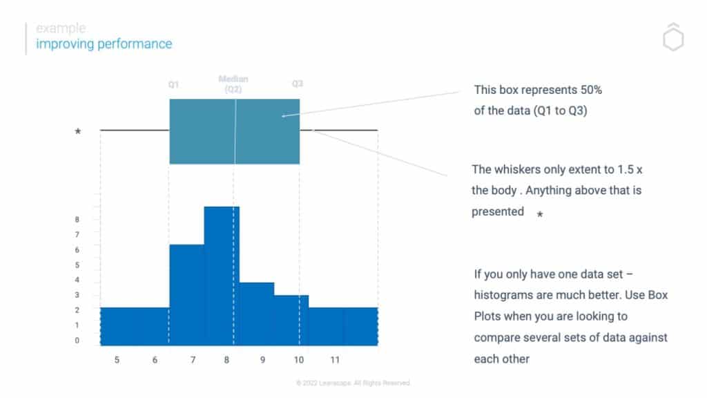
As you can see in the example below, this dataset is relatively symmetrical; the median value is close to the center and we have an outlier to the left. The box plot actually represents the data from the histogram and therefore offers very valuable information when comparing two elements or process performance against each other.
Creating a Box Plot
There are two main ways to create a box plot: raw data or summary statistics. You can create a box plot using Excel, R, or Python if you have raw data. If you only have summary statistics (i.e., mean, median, etc.), you can still create a box plot; you’ll just need to use a “back-to-back stemplot.” We won’t go into detail on how to create back-to-back stemplots here, but rest assured that it’s not difficult to do.
Interpreting a Box Plot
Once you’ve created your box plot, it’s time to start interpreting it. As we mentioned earlier, one of the main things you can use a box plot for is identifying outliers. An outlier is a value significantly different from all other values in the dataset. Errors in measuring or recording data can cause outliers, or they could indicate actual unusual events (e.g., unusually high birth weights). To identify outliers using a box plot, simply look for values that fall outside of the whiskers; these are your outliers. In our example above, there are no outliers present.
Another thing you can use a box plot for is checking for symmetry. To do this, simply look at where the median line falls within each group; if it falls close to the centre of the group (as it does in our example), then your data is probably symmetrical. However, if it falls closer to one side or another (as it would if your data were skewed), then your dataset is probably not symmetrical.


Conclusion:
The Box Plot is a graphical representation of data that shows the distribution by plotting individual data points along an axis scaled according to their value relative to other points in the dataset. It consists of five key elements:
Median Line, Upper Quartile Line, Lower Quartile Line, Whiskers (representing Minimum and Maximum Values), and Outliers (data points falling outside whiskers).
Box Plots give us great insights into our data without having to view each data point which could be very time-consuming, especially when working with large datasets. Additionally, we can use them to check for symmetry and identify outliers.
Overall, Box Plots are extremely useful visualization tool and should be in every Data Scientist’s toolkit. You can learn more on our Yellow Belt or Green Belt Course.